The Outbound Brand
When Aaron and Taylor set out to create the Outbound brand, they wanted it to be an expression of the company's values and mission.
When we originally set out to create our logo in 2019, Taylor and I had a long conversation about what was important in our values and how to represent them visually. Mountains became the core symbol and key element of the Outbound logo from its first iteration. Mountains are symbolic as they are a place we personally go to for adventure, exploration, and pushing boundaries. Outbound's name originated from the idea of individually embarking on a journey of discovery and exploration.
The implied lens in Outbound’s logo is a symbol to emphasize the company's focus on photography. The lens is representative of the idea of perspective and the power photography has to shape our perception of the world. The concept of perspective and visual storytelling is central to Outbound’s approach to capturing images that tell a unique story.
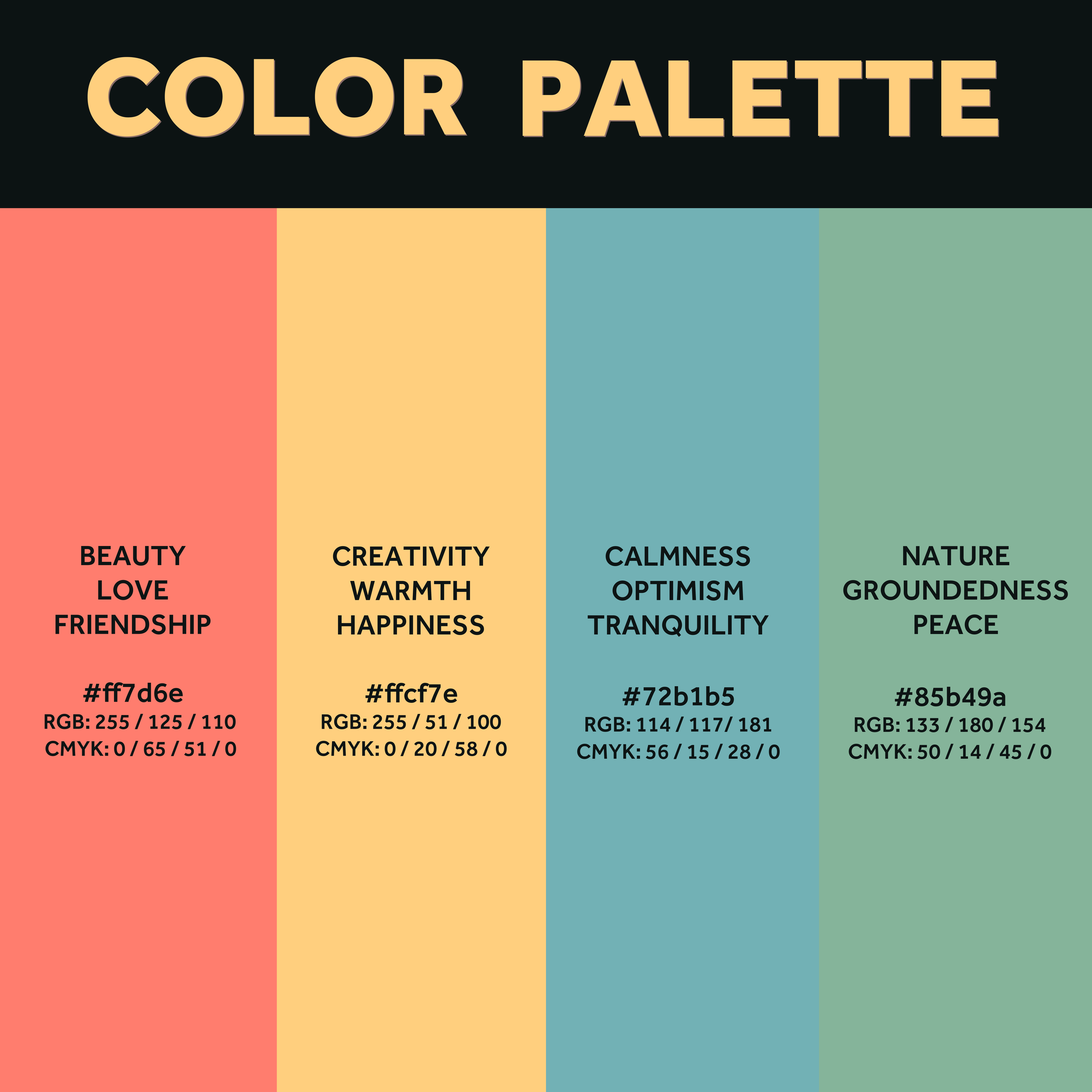
The choice of color palette in Outbound Photography reflects the company's focus on the outdoors and natural beauty. Each color has its own meaning and symbolism, which contributes to the overall message of our brand. The choice of earthy tones and natural colors serves to reinforce the company's focus on capturing natural beauty.
The red hue represents the beauty and emotion captured in each photograph, as well as the strong connections that can be formed through stories.
The yellow hue represents the creative process of photography, as well as the warmth and joy that comes from being outdoors and connecting with nature.
The blue hue represents the peace and serenity that can be found in the natural world, as well as the sense of optimism and hope that comes with exploring new places and experiencing new things.
The green hue represents the beauty and majesty of the natural world, as well as the grounding and calming effect that being outdoors can have on the mind and spirit.
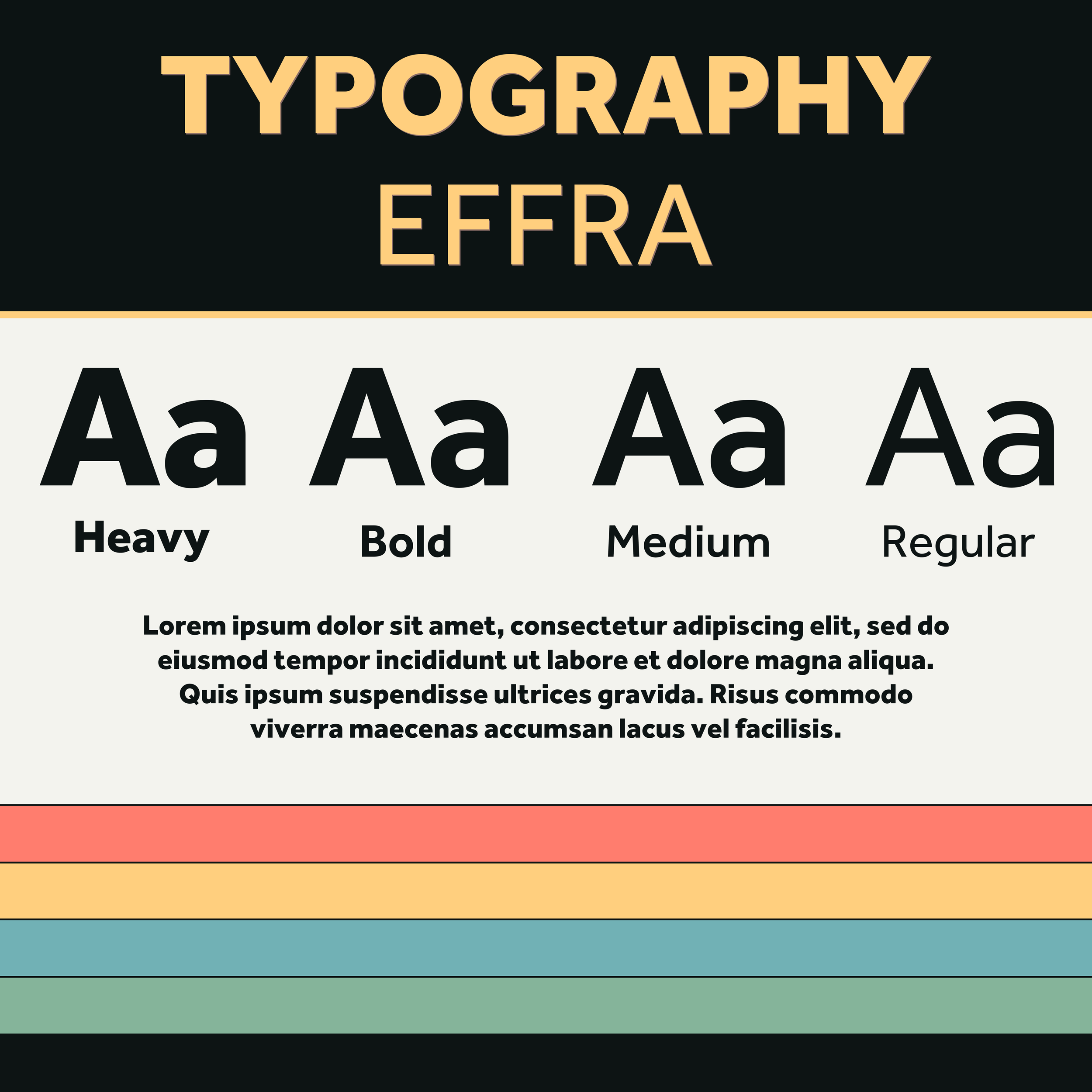
Taylor and I wanted to choose a font that reflected the company's commitment to high-quality design and visual aesthetics. We ended up falling in love with Adobe’s font, Effra. Effra is a modern sans-serif typeface that is both elegant and versatile, with clean lines and geometric shapes that give it a timeless and contemporary look.
In addition to its aesthetic qualities, Effra is also highly legible, making it easy to read and understand even at small sizes. This is an important consideration for a company like Outbound Photography, where clear and effective communication is essential. The typography represents our commitment to excellence in all aspects of work, from the quality of photographs to the design and presentation of materials. By choosing a font that is both visually appealing and highly functional, we are able to demonstrate commitment to professionalism and attention to detail.
At the end of the day,
Despite all the logo designing, color palette, and typography, we're just two small-town Idahoan goobers who are passionate about what we do. We believe that everyone and everything has a story worth telling, and we're committed to capturing those stories through the lens of our cameras. For us, it's not just about taking pictures, it's about creating something that will be cherished and remembered for generations to come. Whether we're scaling mountains and exploring hidden trails, or searching for a new view atop a highrise in downtown Boise, we're always looking for the next adventure, the next story to tell. And at the end of the day, we hope that our work inspires others to see the beauty and wonder of the natural world and to appreciate the unique stories that make each of us who we are.


